
You who read us, never a ‘you who read us’. EL DÍA writes and speaks Canarian and has chosen May 30 to give its readers a special cover: the mural that the artists Felipe Galve and Javier Montelongo, from ‘El Trato’, have designed and painted in the old reel warehouse of the Newspaper.
Geographically, Spanish is divided into eight unique and special dialectal varieties. It is the fourth most widely spoken language in the world – more than 543 million people currently use it to communicate – and of those eight varieties, one is Canarian. That is a source of pride.
The two headers of Prensa Ibérica in the Canary Islands, the newspapers THE DAY-The Opinion of Tenerife Y The Province/DLP, celebrate today the canaries day bragging about the way they speak in the Archipelago. The Islands have one of the most recognized and beautiful accents, a way of speaking that connects the islanders with their historical relatives – Andalusians, Portuguese and Latin Americans – and with their status as a geographical and cultural bridge.
Therefore, nothing better than art to show that pride. The newspaper has turned its cover into a large mural that comes with the signature of two young Canarian creators: Felipe Galve and Javier Montelongo. Together they are El Trato and just a week ago they accepted the challenge: to create a large painting on one of the walls of the facilities of the old reel storage area next to the EL DÍA printing press.

The result is a spectacular tapestry six meters high by four meters wide full of color and that reflects some of the identity elements of the Islands. The expression chosen as the central motif is a great “Ños”, a voice with which canaries show surprise as well as displeasure or recognition. Because in the “Yes!” both context and intonation matter. “Yes, that’s good” is not the same as “noooooooo, get out of there.”
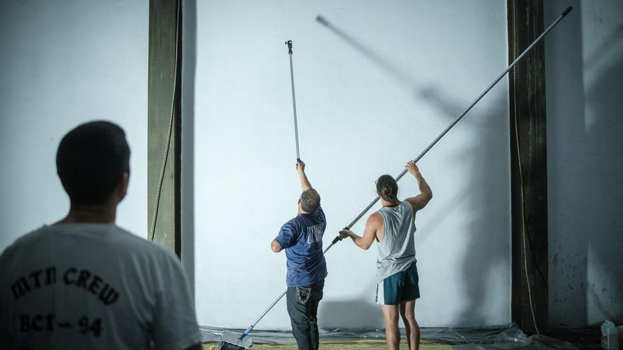
More than 20 hours of intense work over three days and 35 colors sprayed on afterwardsGalve and Montelongo have completely transformed the image of the coil warehouse.
This mural is going to be, they joke, the most hidden and at the same time the most seen piece of its type –thanks to its wide circulation in the press– of his entire career. The first steps of his execution were the most complicated. A canvas of these dimensions requires security measures and a very specific material. For this reason, they took advantage of last weekend to polish the final design and apply the first primer that prepares the wall to become a gigantic canvas. The Deal (@el.trato.co on instagram) is the name with which Galve (@sr.galve) and Montelongo (@mr.monteloco) have baptized their creative union. The former is also one of the newspaper’s graphic designers. The second is the hand and the thinking head behind Osss.Trademark, a brand of textile products based precisely on popular Canarian iconography.
Previously, they had already worked together on other similar projects in El Hierro and the municipality of La Laguna, but this one, on May 30, is undoubtedly their first great challenge. «That they offered me to do something like that in the newspaper was something that I did not expect. They know that I am an illustrator but I did not foresee this type of proposal. I was very motivated, “explains Galve, trained in graphic and advertising illustration and one of those in charge of making sure the newspaper’s design is perfect.
The assignment, they say, came just at the best time. After the forced stoppage of the pandemic, El Trato had recently considered resuming this type of work. “It was what we wanted, to start doing work like this,” they celebrate. “Being an illustrator and a designer you start to try all the techniques on your own. Try charcoal, watercolor, etc. We like to discover things in order to master them. The challenge of facing a wall is something that has always given us respect. It is a very large format and there is the added difficulty of fitting the proportions into a wall like this. This one is huge: about six meters high by four wide. But it is also that idea – the possibility of overcoming that challenge and saying that we have been able to – what is most attractive. That and that in the end the visual impact it has, just because of the size, surpasses anything else you do, “acknowledges Montelongo.
Complexity of execution
The next step, after preparing the wall, was to get down to work and draw the drawing that would serve as the basis for the rest of the design. Everything –typography, variety of colors and motifs– was chosen to give prominence to that “Ños”. “We have explained everything we wanted to make it as attractive as possible,” says Montelongo. «A priori, it can be thought that it is an expression that is very hackneyed but we also take care of changing that. We’ve given it a more interesting typeface and brought it more into our turf, at least in general terms,” he adds.
To make this work of art a reality, They used 35 sprays of different colors. This speaks of the complexity of its execution, with multiple panels and a careful color treatment. The interior of the letters houses an explosion of warm colors that are a reflection of the overwhelming nature of the Islands: a tajinaste in flower, an old woman emerging from the depths, a baifo, a mountainous profile under the sunset, the beauty of the skies nocturnal of the Islands and some Canarian cardones. “It has a lot of details and that has also been a great challenge. We have put a thousand ways”, adds Galve. «It has volumes and we put a shadow on it so that it would not be so flat and the letter would float on the wall, which is a very large white cloth. There are also quite a few gradients. There is a lot of layer and depth », details his partner.
The artists of El Trato consider themselves new to this mural and are grateful for the opportunity to have created one so special and with so much meaning. “Going out on the cover on the one hand was an even greater incentive and, on the other, a tremendous responsibility because you had to meet deadlines and quality,” says Montelongo. “You have to keep in mind that we are new to this. This is a step further in this field where there are so many good artists in the Canary Islands, they are tremendous and inspire us. Maybe in a few years we will be able to do something similar to what they do”, concludes Galve.
The surprise detail of a work of art
The Canary Islands Day mural is full of details, both within the letters and in the elements that adorn it. A strip accompanies the main element, as if it were a shield, and includes the expression “Más canarios que el gofio”, the Roman numeral that records the year in which it was made and the phoneme of the expression “Ños”. But there is another small hidden detail, a kind of game that El Trato introduces in its creation and that is a nod to the pioneers of the world of graffiti. It is the small crown drawn on the head of the baifo. «We have put it because it is an element that has been used repeatedly in graffiti and, therefore, is related to this type of artistic expression. In this case, moreover, we have placed it as a vandalism element, as if someone had painted over the mural. It has irregular strokes and a trickle of ink falling to make a nod to what was once graffiti. In some way we are also referring to the fact that we are new to mural art and how much we still have to learn”, explained Galve.


")


